INTERACTIVE DESIGN/FINAL PROJECT
INTERACTIVE DESIGN

23/10/2023 - 10/12/2023/Week 9-Week 14


I realised that the logo I made did not come through when I typed in the code after so many times, I learned from my peers that I could just put the logo within Photoshop and export it later to make my life easier.


After making the gallery, the lightbox required to use of certain
Javascript features at the end of the gallery HTML code to make it
functional. Fortunately, the gallery result was quite satisfying for me.


Nur Fariha Binti Mohd Rodzuan/0351242
Interactive Design/Bachelors(Hons) in
Creative Media
Final Project Working Single Webpage
LISTS:
Introduction
INTRODUCTION
Module Information Booklet
Project Requirements:
Artist Selection: Choose your favourite artist as the subject of your website. It can be a musician, painter, actor, or any other creative individual or group. Ensure you have a genuine interest in the artist, as this will help you create a more engaging website.
Content:
Your single-page website should include the following sections:
Header with the artist's name and a brief tagline.
Introduction: Provide an overview of the artist's background and why you admire them.
Biography: Include a brief biography or description of the artist's life and career.
Gallery: Showcase images, videos, or other multimedia related to the artist's work.
Contact Information: If applicable, include contact details or links to the artist's social media profiles.
Design Elements:
Choose a colour scheme and fonts that reflect the artist's style or your personal taste.
Ensure a visually appealing layout with a balanced use of text and multimedia.
Create a responsive design that adapts to different screen sizes (mobile-friendly).
Navigation: Implement smooth scrolling navigation or a simple menu that allows users to jump to different sections of the page.
Interactivity: Consider adding interactive elements such as image sliders, hover effects, or lightboxes for multimedia content.
FINAL PROJECT: SINGLE-PAGE WEBSITE FOR YOUR FAVOURITE ARTIST
1. Choosing an Artist
My initial artist was Rage Against the Machine, a band that I usually listen
to as I go to class at 6 am in the morning. But then, I decided to change my
artist to Laufey who happened to be my top most-played artist this year. In
Addition, I feel that my vibe would suit modern jazz more than a rock band
at the moment. Very contrasting type of genres, I listen to all types of
song as long as it matches my mood, yes.

Rage Against The Machine

Laufey (chosen artist)
2. Mood Boards:

fig 1 Moodboard on Laufey
In this mood board, I decided to compile pictures and inspiration from a
website display that I found on Pinterest that I felt would fit the vibe
of my chosen artist. Furthermore, I planned on using earthly colours for
her website since her songs are quite mellow in nature, not to mention her
new album cover was pretty much earth-tone.
3. Assets
After I was done structuring the prototype, I decided to collect materials
for the picture gallery, as well as make a simple favicon and a simple
logo for my chosen artist. I edited the background picture of the landing
page in Photoshop.
For the font, I decided to use Bodoni Moda (semi-bold Italic, Regular,
Bold). I had a look at Laufey's official page and her overall aesthetic
usually uses serif types. So I decided to use a decorative font with
different line weights for easy readability. Thank god, I found them in
Google Fonts.

fig 2 Bodoni Moda in Google Fonts

fig 3 Favicon (left) and logo in black and white

fig 4 Compilation of pictures for the gallery view
4. HTML Structure:


Full HTML Code
5. Styling HTML with CSS
- Navigation bar
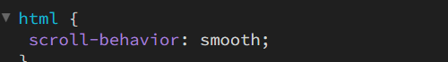
fig 4 CSS code for making smooth scrolling effect to anchor pages in
the same website.

fig 6 Prototype Landing Page in Figma

fig 7 HTML structure for the navigation bar

fig 8 CSS structure of the navigation bar.
- Landing Page:
The landing page was really hard for some reason because I needed the
picture of the artist to fill up the space and somehow my picture did
not look clear. when I put it in CSS. So here's the thing, I made the
navigation as well as the whole landing page under a <header> tag
(I don't know if this is a good idea), I couldn't think of a way to keep
the picture at the particular landing page since I didn't want it to
stretch all the way through.

fig 9 Attempt #1 on trying to make the picture stay on the landing
page
I realised that the logo I made did not come through when I typed in the code after so many times, I learned from my peers that I could just put the logo within Photoshop and export it later to make my life easier.
- About the Artist Page:
At first, I used the <div class=column> to make two columns,
however for some reason it didn't work so I hopped into Blackbox Ai
and tried to find a solution to the problem by using <div
id="section"> and it worked.

fig 10 HTML code for the about artist page using

fig 11 CSS file on the About Artist page

fig 12 About Artist section in preview
- Gallery View
Creating the gallery view was not as difficult as making a carousel. I
followed through the video tutorial on YouTube.
fig 13 Gallery view and lightbox tutorial
fig 14 Responsive gallery.

fig 15 HTML code for Gallery


fig 16 CSS stylesheet on gallery
There wasn't much issue in making the gallery since I followed the video
to a T. However, the gallery view wasn't what I wanted to look like
within my prototype. I thought that the compositions were fine and might
make it easier for me to change the view to a smaller screen, so I just
left it be.

fig 17 Figma gallery view

fig 18 Gallery view within the website after following the tutorial
video

fig 19 Lightbox responsive image
- Music Album
I tried creating a carousel to showcase the music album. So I searched
through YouTube for a video of the carousel feature. Here are some of the
YouTube videos that I referred to:
fig 20 Infinite Carousel Slider
fig 21 Bootstrap 5 Carousel Multiple Slider.

fig 22 Attempt to create the carousel for the music album

fig 23 The carousel box with the albums side by side
Inserting the music album picture went smoothly, I was able to fix the album
pictures by changing the max-width of the wrapper box to 1500px. The real
issue began with trying to incorporate javascript features, even after
adding the bootstrap link, it wasn't working well. I began thinking that
using a carousel wasn't a good choice to showcase only four albums. I looked
through the Laufey website and found that she places a compilation of her
music in a Spotify playlist. So I wondered if I could do the same for each
and every album that I wanted to showcase (and I did).
fig 24 Video on how to add
Spotify playlist in HTML

fig 25 Final Spotify playlist with her albums
- Adding Favicons:
I remembered changing the line of codes a few times when it wouldn't come
out in the preview when my friend broke the news that it only appeared after
I uploaded the website into the Netlify app.
fig 26 HTML code of favicon placed within the head section

fig 27 Working Favicon!
FINAL WEBSITE:

fig 28 Screengrab of entire website
Final compilation of HTML and CSS code (PDF)
REFLECTION
The work was quite an enjoyable journey, I was able to learn a lot about my
favourite artist and made a website that could showcase her work. It was a
blessing that Sir extended the deadline by one week. I was able to block off
some time to finish this assignment as a result. This work involved a great
deal of research and Googling. For the whole assignment, my best pals were
YouTube and Blackbox AI. Sometimes I would struggle to get the code to work,
but once it did, I felt accomplished, which motivated me to keep working on
the problem. My only regret is that I did not include the website's carousel
features since I struggled to make it.
While going through the tutorial video, it is important to move on to other
tutorials if it didn't work for you, I totally learned my lesson because I
was adamant about watching the video until the end and tried to make changes
to my preferences in the end which is not really a good idea. The overall
experience of making a website requires a very long time, therefore never
ever procrastinate while doing coding. In conclusion, I feel like I still
have so much to learn from coding and especially using javascript since it
looks like it plays a huge role in creating responsive websites, not to
mention that it uses an unknown integer 'n', I wonder if Javascript requires
math skills. I was satisfied with certain parts that I was able to code and
make it functional however, with a lot of practice, could make it even
better. It took me quite a long time to understand how to use classes and
all the elements since the first class so, I hoped I could further enhance
my skills in coding so that I could create more complicated and smooth
websites in the future.
Comments
Post a Comment