INTERACTIVE DESIGN-EXERCISES
INTERACTIVE DESIGN

28.08.2023- 14.07.2023/Week 1 - Week 8
LABELS:
Lectures
Instructions
LECTURES:
Week 2: Usability: Designing Products for User Satisfaction
Week 3: Understanding Website Structure
Week 4:
Week 5:
Week 6:
Week 7: Box Model
-Usability refers to how effective, efficient and successful a particular user can utilize a product/design in certain situation. This is the second level of UX design and a design usability depends on how well the features accommodate user's need and contexts.
-Users encountering an interface should be able to find their way easily to achieve their objective without expert knowledge.
Principle of Usability
- Consistency ensures that websites look coherent and across all different element (headers, footers, side bars and navigation bars)
- Consistency creates pattern to be recognized by users, similar looking things should produce similar output. For instance, if website's buttons are protruding boxes with labels on, then all other buttons should be the same.
- Navigation system, page layout and menu structure, fonts and typography and branding in website should also be consistent.
- User interface should be simple for users. Simplicity refers to the need to minimize the numbers of steps involved, use symbols and terminology that makes interface as obvious as possible, and difficult to make mistakes.
- Applying simplicity will help design better user interfaces by helping users achieve their goals faster and more efficiently.
- The more visible an element, the more likely users will know about them and how to use them.
- Users should know just by looking at an interface, what their opinions are and how to access them.
- For instance; Icons, thumbnails and using different color on call action buttons to make it more visible and that the buttons are clickable.
- Communicates results of any interaction, gives user a signal that they have succeeded or failed at performing a task.
- Example; Progression bar when you download something, when a website loads longer it gives you a looping indicating it's loading to the users, feedback through sounds.
- Alerting a user they're making an error, with the intention to make it easy for them to do whatever they wanted without making a mistake.

- HEADER- The top section of webpage, usually contains website logo, navigation menu and contact information. The header is a quick access to essential information for user.
- BODY- The main content are of a webpage that contains text, images, videos and other elements.
- FOOTER- The bottom section of the page that includes copyright information, links to important pages and contact details.
- Use headings (H1,H2,H3,H4) to create a hierarchical structure, clear labeling of sections and also logical grouping
- Helps user to move around the website faster.
- Use clear concise labels for menu items
- Consider using dropdown menus for complex sites.
- Display is CSS's most important property controlling layout
- Each element has a default display value depending on what type of element it is.
- Default for most elements is usually block or inline
- Block: The structure collapses, each line of could would be a new line on display
- Inline: Inline-block does not add a line-break after the element, so the element can sit next to other elements.
- Block-level elements have a default size setting if you don't change it.
INSTRUCTIONS:
Module Information Booklet
EXERCISE 1: Web Analysis
What To Have in The Analysis:
- Consider the purpose and goals of the website, and evaluate whether they are effectively communicated to the user.
- Evaluate the visual design and layout of the website, including its use of color, typography, and imagery.
- Consider the functionality and usability of the website, including its navigation, forms, and interactive elements.
- Evaluate the quality and relevance of the website's content, including its accuracy, clarity, and organization.
- Consider the website's performance, including its load times, responsiveness, and compatibility with different devices and browsers.

There are four main steps on how to analyze the effectiveness of a website and also questions to ask ourselves as we began inspect the website's technical, strategic and visual aspects.
- Be concise on who you're trying to reach. For instance, e-commerce websites emphasize more on transaction-focused (direct purchase of products/services) with less clicks.
- Identify characteristics of audience through Website Demographics.
- Is the site clearly focused on the right users and their needs?
- Is the site structure designed to deliver convenient user experience?
- Is the site optimized to be found and promoted by search engines like Google (i.e does it have good SEO)?
- Is the content relevant and optimized for users and SEO?
- Different visitors comes at different stages of journey: Awareness, Evaluation, Conversion and Retention
- Use Digital Analyzing Tools (Software solutions that help marketers to collect, analyze and interpret data from various resources).
- Does the site follow best-in-class design trends?
- Is it relevant compared to other sites in your industry category?
- Is the site designed to be 'mobile first' (does it display on phones and tablet well?)
- Content Clustering: A topic cluster (or content cluster) is a group of content assets on a website that are all centered on a related topic.
- Is the website fast enough to meet the user's need?
- Do all the links work?
- Is there sitemap that people (and search engines) can follow to find the key pages?
- Is the site protected? Is it compliant with the data capture and management rules?
- Is the content update regularly? This helps to push up the site's page ranking on search engines.
- Before starting a website layout, its crucial to create the basic structure of the website by creating a sitemap which gives the basic direction for your layout.


- Design a home page layout for a website using basic visual elements and the Bootstrap grid system.
- The website should include a homepage with a slider image, logo, and a main menu, with an emphasis on clarity and simplicity.
- The wireframe should include arrows for navigation and a hero image that runs behind the front page.
- Additional sections can be added to the homepage, such as testimonials or sponsors.
- Each section should be labeled in the wireframe to make it easy to understand.
- The footer should also be included with common elements such as a logo, contact form, contact information, and social media links

.png)
- To be honest, I did not realize that I was able to extract the font information required in the replication from the inspection page until I came to check references from other students to come to that realization, but at least I'm able to use it on the second website instead. Fortunately, the font 'Arial' was available in photoshop and I was able to replicate similarly to the original website.


.png)
- For this website, I changed the fonts to similar ones such as Banshrift for Headings and subheadings and Calibri for body text.
.jpg)
.png)
.png)


.png)

.jpg)

fig 7 Decorated the navigation bar with CSS week 6 (2/10/2023)


.png)
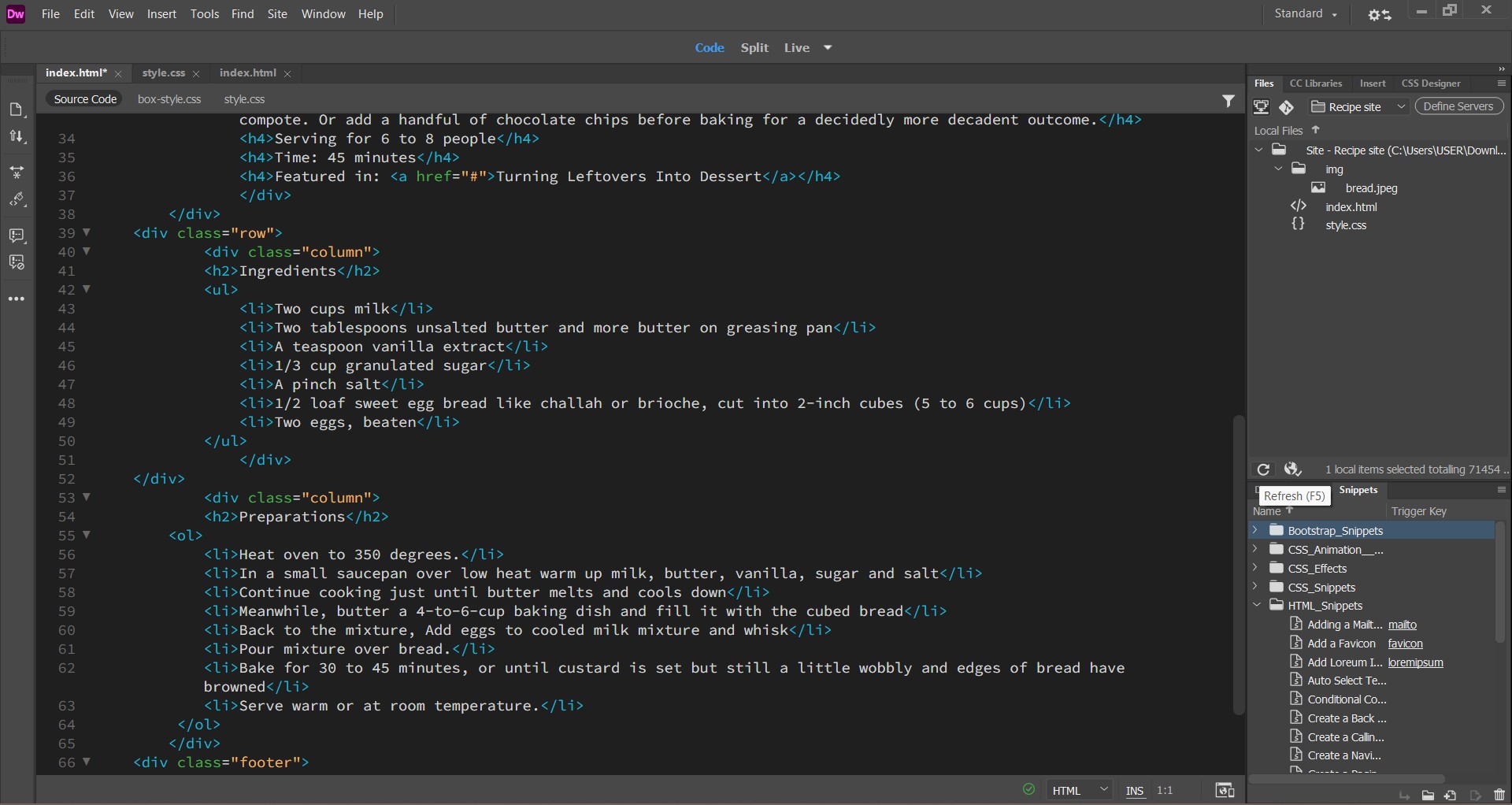
- The size of the image and column box really bothered me at how unaligned the size were so added background colour as well in the left column.

.png)
.png)

.jpg)
.jpg)


- How to conduct a website analysis. (2023, July 19). BDC.ca. https://www.bdc.ca/en/articles-tools/technology/create-website/how-conduct-website-analysis
-
https://www.geeksforgeeks.org/how-to-create-a-wireframe-in-software-design/
Comments
Post a Comment