ADVANCED TYPOGRAPHY-TASK 1/EXERCISES
ADVANCED TYPOGRAPHY
30 August 2023
30.08.2023- 20.08.2023/Week 1 - Week 4
Nur Fariha Binti Mohd Rodzuan/0351242
Advanced Typography/Bachelors(Hons) in
Creative Media
Task 1/Exercises 1 & 2
Lists
Lectures
Introduction
LECTURES
Week 1: AdTypo_1_Typographic System
Week 2:
AdTypo_2_Typographic Composition
Week 3:
AdTypo_3_Context&Creativity
Week 4: AdTypo_4_Designing Type
AdTypo_1_Typographic System
1. Eight major variations according to Elam (2007):
- Axial
- Radial
- Dilatational
- Grid
- Transitional
- Bilateral
- Modular
- Random
2. What is the
typographic system?
A set of rules that provides a sense of purpose to focus on and helps in
making decisions, the term is similar to what architects call
shape grammars (a set of shape rules that is applied step by step in
order to create a set, language of designs).
Axial System
All elements are organized to the left or right of a single
axis. These are some variations of Axial Designs that can be implemented:
- Angle your axis: Text and graphic can be either symmetrical or asymmetrical on either side as long as it's one axis.
fig 1 Angle your axis (from Type365)
- Adjust the Column Width: Adjusting the column with can add texture to your text, wider column gives you more room to play.
fig 2 Adjust the Column Width (from Type365)
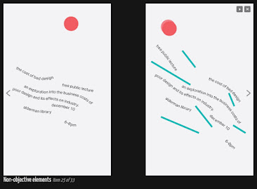
- Add "non-objective' elements: Adding circles, squares, triangles or rules to make the design more appealing. We can also use this to create attention to different pieces of text or balance the page.
fig 3 Add 'non-objective" elements (from Type365)
- Implicit vs Explicit Axis: Usually we imply our axis using text instead of a line, we can line up the text with a photo, background, graphic and etc.
fig 4 Implicit vs Explicit axis (from Type365)
- Mess with the Text: Get weird, want to slow down the viewers so that they pay attention? try stretching the word or phrase and or remove punctuations.
fig 5 Mess with the Text (from Type365)
Radial System
All elements are extended from a point of focus. Imagine the sun,
jellyfish, tires, domes uses radial layout. Better to use it in posters or
interactive websites and avoid using Radial System on books.
fig 6 Radial System example (Type365)
Dilatational System
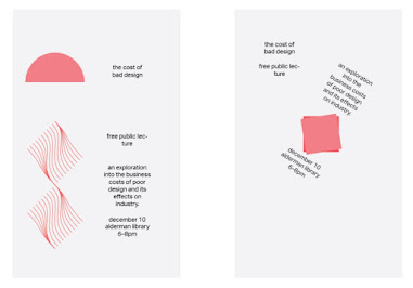
All elements expand from a central point in a circular fashion. The texts
curve around a point, for instance, tree trunks could be a good example of
Dilatational System. This type of system is suitable for small blocks of
text and posters.
Grid System
A system of Vertical and Horizontal divisions.
An informal system of layered banding. The appearance is similar to cross
section earth-with layers of sediment and stone. Due to it's
disorganized nature, the system is likely more suitable for posters and book
covers.
- Movement- Imply movement or slippage in the composition.
fig 9 Example of Movement (Type365)
- Direction- The text can all line up or it can fall each other, straight or diagonal. It all depends on the content.
fig 10 Example of Direction (Type365)
- Use non-objective elements- Including simple shapes and rules can accentuate the design.
fig 11 Example of Non-Objective elements (Type365)
Bilateral System (centered)
All the text are arranged symmetrically on a single axis. There are a
few ways to create interesting visuals using Bilateral System by using
vertical spaces, horizontal spaces, multiple groups (breaking content
into two or more groups), Tilt (slant the axis) and use non-objective
elements.
fig 12 Example of Bilateral System (Type365)
Modular System
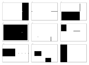
A series of non-objective elements that are constructed in a
standardized unit. Come up with repeatable structure that fits the
content. For instance, put everything into squares or circles.
fig 13 Example of Modular System (Type365)
Random System
Elements appear to have no specific pattern or relationship.
The Rule of Thirds
- A photographic guide to composition. A frame(space) are divided into three columns and 3 rows, intersecting lines are guides to place point s of interest, within the space given.
fig 15 Use of Rule of Thirds as a layout
- Of the 8 systems covered in the first lecture, Grid system which was derived from grided compositional structure of letter press printing is the most popular.
- The grid system was further enhance and come to be termed as Swiss (Modernist) style that are used by Josef Muller Brockmann, Jan Tschichold, Max Bill and etc.
fig 16 Swiss (Modernist) Style
- Although the grid system is old, it's versatile and modular nature gave an opportunity to experiment infinite number of adaptation, that's why it remained popular.
fig 17 Various adaptation of the grid system
- Young designers influenced to the modernist era challenges this notion of order and created post-modernist era which was chaos, randomness, asymmetry were explored. The chaos was exciting to new generations and exposed to Punk anti-establishment thought and music.
- Because of this, asymmetry, random, repetitions, dilatational and radial systems began to be used in the field of designer.
fig 18 Left to right: Paula Scher, Jonathan Barnbrook and David
Carson
Environmental Grid
A system based on the exploration of existing structures or numerous
structures combined. Extracting crucial lines both curved and straight.
With this, Designers are able to organize information around the unique
structure and include non-objective elements with exciting mixture of
texture and visual stimuli.
fig 19 Example of extraction by Brenda McMannus of Pratt. Inst. from
the book: Typographic Form and Communication, pp211.
This is based on exploration of existing Grid System. Placement of a form
on a page over many pages create movement.
fig 20 Static Version of the form place on spread (grid hidden), ensure
care in visual connections and surprises in every page
fig 21 Animated Version, the book spreads mimic the frame by frame
nature moving screen
fig 22 Compositional practice, the level of complexity increase as
newer elements are introduced: adding one colour, then image, than
dummy text and etc.
AdTypo_3_Context and Creativity
Handwritings are the standard basis for form, spacing and
conventions mechanical type that we try and mimic. Letterforms shape
and line are influenced by the tools and materials used to make
them.
Some materials used in the early days consist of:
- Sharpened bones
- Charcoal sticks
- Plant Stems
- Brushes
- Feathers and steel pens
Another factor to unique characteristics of the letterform also
lies in the material where it was written: Clay, Papyrus, Palm Leaf,
Animal Skins (vellum and parchment) and paper.
fig 24 Cuneiform system
- Earliest system of actual writing, 34C.B.C.E. through the 1st century C.E
- Distinctive wedge result from pressing the blunt end of a reed stylus into wet clay tables.
- Characters evolved from pictogram
- Written Left to Right
2. Hieroglyphics (2613-2160 B.C.E)
fig 25 Hieroglyphic Chart
- The style fused with the art of relief carving
- The system is a mixture of both rebus and phonetic characters.
- Hieroglyphic images have the potential to be used in three different ways:
-As an Ideogram, to represent what it actually
depicts
-As determinatives to show the signs preceding
are meant as phonograms and to indicate the
general
idea of the world.
-As phonograms to represent sounds that
"spell out" individual words.
3. Early Greek (5th C. B.C.E)
fig 26 Early Greeks system
- Built on the Egyptian logo-consonantal system, the Phoenicians developed a phonetic alphabet consisting of 22 letters,
- Phoenicians then was adopted by the Greeks who added the necessary vowels.
- Early Greek comprises of only capital letters, written between two guidelines to organize them in horizontal rows.
- The direction of reading is not yet fixed therefore, Greek was often read in a format known as boustrophedon or 'as the ox plows'. (One row would read left to right and then switch from right to left).
- The letters were written freehand and they have no serif.
- When the strokes grew thicker, the aperture lessens and serifs appeared.
- New forms used for inscriptions serves as a models for formal lettering in imperial Rome.
4. Roman Uncials (4th century Roman Letters)
fig 27 Roman Uncials
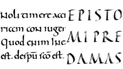
- By the 4th Century, Roman letters become more rounded, the curved form allowed for less strokes and could be written faster..
fig 28 English Half-Uncials
- In England, the uncials evolved into a more slanted and condensed form.
- While English and Irish uncials evolved, European continent devolved considerably and needed a reformer and that is when Carolingian Handwriting Reform comes in.
fig 29 Carolingian Minuscule
- A court school was established under the direction of Alcuin of York.
- During Charlemagne's patronage book production increased and language was standardized (pronunciation, spelling, writing conventions, capitals at the start of sentences, spaces between words)= The Carolingian Minuscule.
- The Carolingian Minuscule was used for all legal and literary works to unify communication between various regions of expanding European empire.
- This was style that became the pattern for Humanistic writing of the fifteenth century: This would become the basis of our lowercase roman type.
fig 30 Blackletter writing (left) and blackletter strokes
(right)
- Gothic is an artistic expression of Gothic which Italians used to refer rude or barbaric cultures north of Italian Alps dating back to roughly 1200-1500.
- Gothic spirit took hold in France, Germany and England where it was manifested through unhindered upward striving: the vertical supplanted horizontals as the dominant line in architecture; the pointed arch replaced the round arch of the Romans; the almond shape or mandorla was preferred.
fig 31 Humanist named the newly rediscovered letterforms
Antica.
- In the Italian Renaissance, the humanist scholars were tying to revive the culture of antiquity. The renaissance embrace of ancient Greek and Roman culture spurred a creative wave through Italian Arts, architecture, literature and letter form design.
7. Movable Type (11 C.-14 C)
- Printing (wood block) had already been practiced in China, Korea and Japan (Dharani Sutra, AD 750) and the earliest known book is the Diamond Sutra book: 16' scroll with the world's first printed illustration.
- In late 14 C, Koreans established a foundry to cast movable type in bronze, allowing thr dismantling and resetting of text.
- Movable type was introduced in 1000-1100 CE. Pioneered by China but achieved in Korea.
8. Evolution of Alphabets
fig 33 Middle Eastern Alphabets (script has been possibly
influenced by the Egyptian Hieroglyphics and Hieratic
Scripts)
fig 34 The evolution of the Chinese script from the Oracle bone
to Seal Script to Clerical Script, Tradition and Simplified
scripts
fig 35 Inscription from Sumatra written in Old Malay using
Pallava script (left) and Pra-nagari (right)
- Pallava (or Pallawa in Malay), a South Indian script originally used for writing Sanskrit and Tamil. Pallava is highly influential, becoming basis for writing systems across Southeast Asia. Another Indian script used in Malay Archipelago is Pra-nagari, an early form of the Nagari Script.
- Kawi, a historical script from Indonesia is derived from the Sanskrit term kavya which means poet. Kawi was used to contact for other kingdom. Ancient Kingdoms in Malay Peninsula would have been using both Indian Script and Kawi to write old Malay language.
fig 36 Other examples of old text scripts
AdTypo_4_Designing Type
General Process of Type Design:
1. Research
- Before creating a type, it is essential to understand type history, type anatomy and type conventions.
- Determining the type's purpose, what it would be used for, what different applications it will be used in such as for school busses or airport signage, etc.
- Examining existing fonts that are presently used could be inspiration/context/usage patterns/ideas/etc.
2. Sketching
- Sketching can be used both traditional tool set (brushes/pens, ink and paper) then scan them for the purpose of digitization or using digital tools such as Wacom, directly into a font design software. Regardless, both have pros and cons, so just use whatever method works for you.
3. Digitization
- Using professional software such as Fontlab and Glyph Apps. There are designers that uses Adobe Illustrator to design and craft the letterforms and exports it into specialized font apps.
- Attention should not be given to the whole form at this stage but also the counter form. The readability of typeface is heavily dependent on it.
4. Testing
- Testing is a part of the refining and correcting aspects of typeface and could also lead to important feedback.
5. Deploy
- After deploying a completed typeface, teething problems that doesn't emerge during the prototyping and testing phases.
- Thoroughness in the testing process is important to ensure teething issue remain minor.
Typeface Construction
fig 37 Construction grid for the Roman Capital using 8x8
cells
Using the grids (with circular forms) can make an easier construction of a letterforms and is a possible method to build/create the letterform
Construction and Considerations:
fig 38 Classification according to form and construction
- Many different forms and constructions must be taken into consideration when creating a new type.
- One of the important visual correction is the extrusion of curved and protruding forms past the baseline and cap line. In addition, this applies to vertical alignment between curved and straight forms.
- A visual correction is also needed for the distance between the letters. Some placement of letters next to each other may not look as good with equal spacing, therefore, the letters must be altered to a uniform 'visual' white space (white space between letters should appear the same (fitting type)
AdTypo_5_Perception & Organisation
Perception in Typography deals with the visual
navigation and interpretation of the reader via
contrast,
form and organization of content. The content can be textual,
visual, graphical or in the form of color.
fig 40 Contrast in Typography
fig 41 Contrast of Size
fig 42 Contrast in Line weight
fig 43 Contrast in Structure
(different letterforms of different kinds of typefaces,
example, monoline serif and traditional serif, or an italic
and a blackletter)
fig 44 Contrast in Direction
(Opposition between vertical and horizontal)
fig 45 Contrast in Colour
(using a second colour, give thought of which element needs
to be emphasized and pay attention to the tonal values of
colour used)
Form refers to the overall look and feel of the
elements that make up the typographic composition. A good
typography tends to visually intriguing to the eye. However
when a typeface is perceived as a form, it no longer reads as
a letter because it has been manipulated by distortion,
texture, enlargement and has been extruded into a space.
Organisation: Gestalt
INTRODUCTION
Module Information Booklet (MIB)
EXERCISE 1: TYPOGRAPHIC SYSTEM
For the first exercise, we are required to explore 8 systems which are
Axial, Radial, Dilatational, Random, Grid, Modular, Transitional and
Bilateral in Adobe InDesign using the contents provided in the MIB.
Instruction videos were given in the lecture playlist.
Requirements:
-Size: 200x200mm
-Colours: Black, White and one additional colour
-Minor graphical elements.
1. PROCESS
fig 1.1 Manual Sketch of the eight typography systems week 1
(30/8/2023)
I started off the process by sketching the composition on paper for Axial,
Radial, Dilatational and Bilateral. For the other four I decided to just
experiment it on the software itself since I needed to use the grid tools in
InDesign and explore random compositions. As for the sketches, I decided to
choose two out of four to digitize on.
Attempt on Axial System:
fig 1.2 Attempted Axial on InDesign week 1 (30/8/2023)
It has been a few month since I started using InDesign, It took me a while to figure out using it again. With the help of pressing the wrong buttons and almost losing my work, in addition to Mr Vinod's tutorials on youtube that helped jogged my memory.
Font used
Left: Universe Lt Std (Bold Condensed), Janson Text LT Std (roman)
Right: Janson Text Lt Std (Bold), Gill Sans Mt (Regular)
Attempt on Radial System:
fig 1.3 Attempt on Radial week 2 (5/9/2023)
For the radial system, I found inspiration from the sun ray (left) and
explosive symbol hazard (right)
Left: Universe LT Std (Bold and Light Condensed), Minion Pro (Regular)
Right: Futura Std (Bold Condense, Bold and Heavy)
fig 1.4 Attempt on Dilatational week 2 (5/9/2023)
I struggled a lot for Dilatational system since I needed to play text around
a circular shape and keeping into consideration of readability.
Font Used:
Left: ITC New Baskerville (Bold Italic, Regular)
Right: Bodoni Std (Bold), Gill Sans MT (Regular)
Attempt on Bilateral System
I decided to divided the columns into six. Although the composition is a
little too heavy on the red elements, a bit imbalance and certain letter
size are a little to big than usual.
Font Used:
Left: Futura Std (Bold ), Janson Text Std (Bold, Regular)
Right: Bodoni Std (Bold Condensed), Futura Std (Book, Heavy, Medium)
Attempt on Modular System
I struggled a lot for the Modular System since it is quite similar to the
Grid System, but I was able to create the layout with using repetitive
elements to differentiate between the two systems.
Font Used:
Left: Futura Std (Bold, Medium, Heavy, Book)
Right: Futura Std (bold), Gill Sans Regular MT (Regular)
Attempt on Random System
fig 1.8 Attempt on Random week 2 (5/9/2023)
Random system was really fun to explore since I could experiment and use
the font type freely and play with the letter compositions. Although
there were a few mistakes that I have overlooked on the left composition
since certain information were missing because I got too caught up with
the randomness.
Font Used:
Left: Bodoni Std (Pretty much all the fonts variation)
Right: Universe Lt Std (More than one font variation)
Attempt on Transitional System
Transitional system is the one I struggled with the most, I wasn't sure on how
to go about this system and most inspiration or examples I've come across are
either too similar to each other or too complicated. I tried to create it
readable with smooth movement as much as I can.
Font Used:
Left: Serifa Std (Roman and Bold)
Right: Bembo Std (Extra Bold, Bold, Semibold and Regular)
Final Task 1- Exercise 1: Typographic System
fig 2.0 Final Axial System-JPEG week 3 (12/9/2023)
fig 2.1 Final Radial System-JPEG week 3 (12/9/2023)
fig 2.2 Final Dilatational System-JPEG week 3 (12/9/2023)
fig 2.3 Final Bilateral System-JPEG week 3 (12/9/2023)
fig 2.4 Final Grid System-JPEG week 3 (12/9/2023)
fig 2.5 Final Grid System-JPEG week 3 (12/9/2023)
fig 2.6 Final Grid System-JPEG week 3 (12/9/2023)
fig 2.7 Final Modular System-JPEG week 3 (12/9/2023)
fig 2.8 Final Task 1: Exercise 1- Typographic Systems-PDF week 3
(12/9/2023)
fig 2.9 Final Task 1: Exercise 1- Typographic Systems with Grid and
Guides-PDF week 3 (12/9/2023)
EXERCISE 2: TYPE & PLAY
For exercise 2 part 1, we are tasked to dissect and identify potential
letterforms within a range of 4-5 characters in a chosen image of a subject
with strong characteristics whether it's organic or manmade.
- Should be uppercase or lowercase only
- Choose reference typeface from the 10 typefaces
1. CHOSEN PICTURE
fig 2.0 Chosen subject- Marble pattern week 2 (5/9/2023)
2. EXTRACTION PROCESS
fig 2.1 Extracted letter E,L,A and M week 3
(12/9/2023)
fig 2.2 Traced in Adobe Illustrator using the rectangle and curvature tool.
From the extracted letters, I noticed that they curve a lot and the letterforms are more liquid and not as structured. Although some letters like L and A had pointed end, which would look good as a Serif font. I decided to choose Janson Text LT Std as my reference, since it suits
fig 2.3 Attempt #1 of straightening the stems and giving the alphabets
structure using Janson Text LT as reference week 3 (12/9/2023)
I tried simplifying and straightening the extracted form but the structure was
still inconsistent, the E and L was too bold for A and M that had thick and
thin strokes. Furthermore, the overall look is just basically squiggly lines
and the flow of letters are not that smooth.
Looking back at the original extracted letters, I decided to change the flow
into one side and bring back a few characteristics from the original extracted
letters. After getting feedbacks from my peers, they pointed out how the
letter 'M' looks a little disproportionate and a little different from other
letters.
fig 2.5 Attempt #3 of creating the type week 3 (12/9/2023)
After examining through the extracted picture, I've come to realized the small
thin lines on the marble patterns which I can incorporate into the letters to
give all the letters a small characteristic that makes them similar. As for
the letter 'M', I made the stems a little wavy to go with the flow of the
letter structure instead of leaving it straight.
fig 2.6 Screengrab of Type Play formation progression week 3 (12/9/2023)
4.INCORPORATE LETTERS INTO POSTER
For part 2 of the exercise, we were required to incorporate the extracted
letters and turn it into a movie poster using the pictures from what we
extracted from. However, for my poster, I had to use a different picture
with the marble texture because the chosen picture for extraction doesn't
suit as a poster background.
fig 2.7 compiled process week 2-week 3 (5-12/9/2023)
fig 2.8 Original extracted letterform comparison to final type
design week 4 (20/9/2023)
fig 2.9 Final Type Design-JPEG week 4 (20/9/2023)
fig 3.0 Letter E-JPEG week 4 (20/9/2023)
fig 3.1 Letter L-JPEG week 4 (20/9/2023)
fig 3.2 Letter A- JPEG week 4 (20/9/2023)
fig 3.3 Letter M-JPEG week 4 (20/9/2023)
fig 3.4 Movie Poster and Type Showcase- JPEG week 4 (20/9/2023)
fig 3.6 Final Type & Play- PDF week 4 (20/9/2023)
HONOR TALENT COMPETITION
As part of the design school, we were required to create an artwork
in any categories given in the competition.
Requirements:
Size: 6,000px x 3,000px
Less than 20MB
Design Elaboration (PDF)
1. PROCESS
For the competition, I wanted to make a wallpaper using the theme:
Cultural prosperity. I took the time to create a mood board for what
kind of inspiration or idea that I wanted to pursue for this
competition.
fig 1.1 Mood board on what I wanted it to look like week 5
(25/9/2023)
My first initial idea was to create a batik pattern that depicts a
folklore that's the reason why there are batik patterns on the very
top of the mood board. However, taking into consideration of how much
time would be needed to be attention to detail and to be able to
execute complicated design may cause me to not be able to finish on
time. Therefore, I decided to narrow down the design structure into a
more simple yet meaningful one.
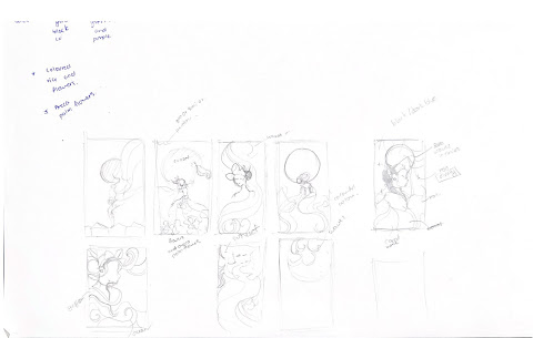
- I wanted to create an artwork that focuses on the ancient folklore of the seven princess of the sea originating from Terengganu, Malaysia or widely known as the traditional dance "Ulek Mayang".
fig 1.2 Thumbnail Sketches of the artworks composition.
To avoid myself from throwing my laptop out the window due to constant
lagging, I decided to continue my artwork into a drawing app called
'Procreate'. For the digitization process, I used one of the
references as the figure example and the rest were drawn out depending
on the subject I was focusing on.
fig 1.3 A reference of outfit for my artwork
Digitization process
I have recorded a time lapse video of my drawing process in Procreate.
fig 2.3 Design Elaboration (PDF) week 5 (26/9/2023)
FEEDBACK
Week 1
General:
-Takeaway points for the lecture instead of an essay, it should
be for my own reference.
-Only put description and figure on lecture pictures.
Week 2
General:
-Balance out the composition, don't make it heavy on one side (grid)
-For transitional: The flow should be consistent and don't create two different movements between the headline and information
-Not recommended to use a circle touching the baseline of text.
-Don't italized sentences in Dilatational System
Specific:
-For transitional: The flow should be consistent and don't create two different movements between the headline and information
-Not recommended to use a circle touching the baseline of text.
-Don't italized sentences in Dilatational System
Specific:
-Downsize the numbers or capital letters to maintain x-height
-For radial #1: Make the wordings a bit bigger
-Radial Black: The information are a bit unaligned, try using the same font, the big red circle is too distracting change it to outline.
-Don't stretch or compressed the text forcefully
-For radial #1: Make the wordings a bit bigger
-Radial Black: The information are a bit unaligned, try using the same font, the big red circle is too distracting change it to outline.
-Don't stretch or compressed the text forcefully
Week 3
General: (Exercise 2: Type Play)
-Make sure your letterforms are consistent
-Look for characteristics in the image chosen
-Make it look like one letterform
-Make our own brush.
Specific:
-Ensure that there is structure in the letterform you are creating.
-The letter 'M' line weight are not balanced.
REFLECTION
Experience:
For exercise 1, I had a lot of trouble using the typographical system
since I needed to refer to the systems and try to create creative layout
within the rules. It took me quite some time to come up with layouts after
week 2, having examined work from my peers to understand how they
incorporate certain systems in their layout such as Modular and
Dilatational which took a long time for me to figure out. Most of
the time, I was afraid that my design would be similar to other students
since most of us would be getting inspiration from the same source or
pictures and I had the tendency to start something new or change to a
completely different idea which caused a lot of delay. However, I had a
lot of fun experimenting with Random system since we were not constricted
to the rules in the other systems. For exercise 2, I find the approach to
creating new type from extracting elements from manmade or organic
elements was intriguing, since it opens the door for me to use existing
elements in creating new type designs.
Observations:
From exercise 1, I realized that balance plays a huge role in making sure
that the layout is well balanced as well as taking into consideration the
other aspects such as font size, kerning, heading and etc. the usual
aspects I needed to consider even back in Typography class. From the type
& play exercise, I learned to observe each letters closely and making
sure to incorporate similar characteristics for each extracted letterforms
so that it's consistent. Truthfully, Type & Play was quite a fun
experience although I had a rough start with it in terms of structuring
the letterforms but it was an interesting exercise to have creating
a typeface
Findings:
In terms of reflecting my habit, I realizes that I was struggling a lot to
keep up with the progression check in class because of my own careless
approach in working on Task 1 and I had been depending on my own and my
peers evaluation of my work. Therefore, there's a lot of planning and time
managing that I need to work on as I go through this module. For the
overall Task1, I actually enjoyed the process of exploring the
typographical system as well as creating typefaces using organic
elements.
FURTHER READING
Finding Type: A Novel Typographic Exercise:
In this article, Mr Vinod compiles work of past students and gave clear
examples and explanation to help us do Exercise 2 which was creating fonts
from an extracted pictures with strong characteristics or preferably
repetitive nature. These process are broken down into the following steps:
1. Finding an image
2. Deconstructing an image
3. Identifying letterforms
4. Extracting letterforms
5. Identify a reference
6. Refining letterforms.
When refining letterforms, introduce consistency in height, width and
contrast. Remove certain characteristics and decide what areas require
simplification. There are some examples that can be used as guidance as I
go through Exercise 2-Type Play.
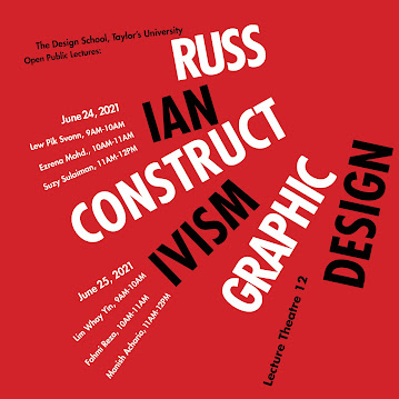
Example of Deconstruction and Identification by Rausha Aminath,
2019
Example of extracted letterforms on a baseline by Tamara Audrey
Saputra, 2019
Example of Extracted letterforms (on the left), reference letterform
on the right (Myriad Regular) and the result in the middle by Tamara Audrey Saputra, 2019.


.png)






.jpg)
.jpg)


.jpg)
.jpg)




.jpeg)
.jpg)
.png)






.png)
.png)
Comments
Post a Comment