TYPOGRAPHY- Task 1/Exercises
.png)
4 April 2023
04.04.2023- 05.05.2023/Week 1 - Week 6
Nur Fariha Binti Mohd Rodzuan/0351242
Typography/Bachelors (Hons) in Creative Media
Task 1: Exercise
Lists:
Instruction
LECTURES
Lecture 1: Typo_0_Introduction
In the first lecture, Mr Vinod gave us an introduction to Typography, an act
of creating letter shapes/typefaces. Typography's description varies on
different sources, according to oxforddictionaries.com, typography is
"the style and appearance of printed matters" while Wikipedia describe
Typography as "The art and technique of arranging type to make written
language more legible, readable and appealing when displayed". Typography are
widely used in different ways such as app and website design, logotypes,
animated forms, etc. Typography have evolved in 500 years from calligraphy to
lettering and finally typography.
After watching the lecture, I finally understood the difference between the
two widely used terminology:
FONT- refers to individual font or weight within typefaces such as
Georgia Regular, Georgia Italic and Georgia Bold. (font comes from the French
word, Found>Foundry: a place that casts metal)
TYPEFACE- refers to an entire family of fonts/weights that share
similar characteristics/style such as Georgia, Arial, Times New Roman,
Didot and Futura.

Lecture 2: Typo_1_Development
Early Letterform development : Phoenician to Roman
Writing was originally scratching into wet slay with sharp sticks or stone
carvings with a chisel. Uppercase letterforms (used for nearly 2000 years)
have evolved around the these tools and materials, uppercase forms are
simple combination of straight lines and pieces of circles which made it
easier to write with the tools created.

4th century B.C.E- Phoenicians Votive Stele Carthage

Evolution from Phoenician Letter
The Greeks developed a style of writing called 'boustrophedon'
(how the ox ploughs) where the lines of text goes from
right to left and left to right evolved from Phoenicians that writes
from right to left. The change of direction made them change the orientation
of the letterforms. Greek and Phoenician writing
does not use letter space or punctuations.

'Boustrophedon' writing style
Etruscan (before Roman) carvers paints letterform on marble before inscribing
them. The qualities of their strokes such as change in weight from vertical to
horizontal and broadening stroke at start and finish are carried over into the
carving process.

Hand script from 3rd-10th Century C.E
Square Capitals- written version on Roman Monuments. Serifs are added to finish main
strokes using a 'reed pen' with 60 degree angle off the perpendicular.
Rustic Capitals- A compressed version
of Square Capitalist, allowing twice as many words on a parchment with
less time to write. The pen/brush are angled at 30 degree angle off the
perpendicular. The style of writing are slightly harder to read due to
their compressed nature.

Square Capitals (4th or 5th century)

Lowercase letterform: square and rustic capitals used in everyday life typically written in
cursive have been simplified for speed and became what we refer to as
lowercase letterform.

4th century: Roman cursive
Uncials:
i. incorporated some aspects of the roman cursive hand (A,D,E,H,M,U and
Q).
ii. 'Uncia' is a Latin word for a twelfth of anything, therefore,
some scholars believed it refers to letters that are one inch/one twelfth of
foot high.
iii. broad forms of Uncials are more readable at small sizes that rustic
capitals.
Half-Uncials: marks the beginning of lowercase forms, replete with ascenders and
descenders.

4th or 5th century: Uncials

500: Half-uncials
Standardized calligraphy
Charlemagne, the first unifier of Europe since Romans, issued an edict in
789 to standardizes all ecclesiastical texts. The task was entrusted to
Alcuin of New York and Abbot of St Martin of Tours. Monks rewrote texts
using both majuscule and miniscule, capitalization and punctuation that sets a standard for calligraphy for
a century.

925: Caloline miniscule
Blackletter to Gutenberg's Type
Disintegration of Charlemagne's empire caused regional variation to
Alcuin's Script. in Northern Europe, a condensed strongly vertical
letterform known as Blackletter or Textura gained attention. While in
the south, rounder more open hand known as, 'rotunda' are more popular.

42 line bible, Johann Gutenberg, Mainz
Typeforms developed as a response to prevailing technology, commercial use
and aesthetic trends.
The following text types (main form of text type) are devised by Alexander
Lawson.


 Tight tracking

 sample type specimen sheet

Lecture 4: Typo_3_Text_P2

 Example how line spacing is used in a paragraph


 Reduced aligned figures (numbers) or All Capital
acronyms embedded in text by .5
Reduced aligned figures (numbers) or All Capital
acronyms embedded in text by .5


4. Headline with text


'C' HEADS


 Example of uppercase letterform in x-height (top) and
normal uppercase letterform (bottom)
Example of uppercase letterform in x-height (top) and
normal uppercase letterform (bottom)
 Sample of Uppercase and lowercase numerals
 Sample of punctuations and miscellaneous
characters
Sample of punctuations and miscellaneous
characters
 Sample of ornamental fonts


LECTURE 7: Typo_6_Screen and Print

Static Typography:
.png)

Lecture 3: Typo_2_Text_P1
Text/Tracking: Kerning and Letterspacing
Kerning- automatic adjustment of
space between letters.
Letter spacing- to add space between the letters.
Tracking- Addition and removal of space in a word or sentence.
Without kerning (left) With kerning (right)
Normal tracking (upper right), Tight tracking (bottom left),
Loose tracking (bottom right)
Uppercase letterforms are drawn to stand on their own while
lowercase require counterform created between letters to maintain
line of reading.

Normal tracking (left) and Loose tracking (right)
Formatting Text
Flush Left- Each lines starts at the same point but ends
wherever the last word on the line ends. Spacing are consistent,
allowing the type to create an even gray value.
Centered- Imposes symmetry and equal value and weight to
both ends of any line. Centered type makes strong shape on the
page by adding pictorial quality to material that isn't by
nature.
Flush right- Emphasis on the end of a line opposed
to its start. It is useful in captions where the relationship
between text and image is ambiguous.
Justified- Imposes symmetrical shape on the text, it is achieved
by expanding/reducing spaces between words or letters. As a
result , white spaces are produced vertically through the text.
(Attention to line breaks and hyphenation to amend the problem).
Texture
Different typefaces usually carries different messages, so it is
important to understand which typeface are suitable for specific
occasion. For instance, type with a generous x-height or heavy
stroke width produces a darker mass on the page that the type
with smaller x-height. The keen observation in color is
important in creating a successful layout.

10/13.5 Adobe Casion (left) and 10/13.5 Baskerville
(right)
Leading Line and Length
Type size- Text type should be large enough to be read
easily at arms length (holding a book in your lap).
Leading- Text that is set too tightly encourages vertical
eye movement; a reader can loose their place when the set is too
loose or etc that could distract them from the material at hand.
Line length- Shorter lines requires less leading; longer
lines more. Preferable to keep line length between 35-65
characters, too short or too long impairs reading.
Type Specimen Book
A book that shows sample of typefaces in various different sizes
nd provide an accurate reference for type, type size, type
leading, type line length etc.

- Compositional requirement: Text should create a field that can occupy a page or screen. Imagine the ideal text as having middle gray value and not a series of stripes.
- Enlarging type to 400% on the screen can give a clear sense of the relationship between descenders on one line and ascenders on the line below.

Example of text with middle gray value(left) and series
of stripe (right)
Lecture 4: Typo_3_Text_P2
1. Indicating paragraphs
Paragraph indicators can be used with several options, one of it is
'Pilcrow' (¶), a holdover from medieval manuscript.
Example how Pilcrow is used in a paragraph
'Line space' (leading) between paragraphs is another option to
indicate paragraph, this is achieved by having the line space and
paragraph space at the same size, (line space=12pt, paragraph
space=12pt) to ensure cross-alignment columns across text.
In standard indentation, indent(start of a line) have
the same size as line spacing or same as the point size of the text.
Example of Standard indentation used in paragraph
Furthermore, extended paragraphs create unusually wide
columns of text. However, there is a potential of strong
compositional or functional reasoning in choosing it.

|
| Example of extended paragraph |
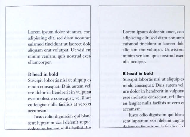
2. Widows and Orphans
There are two unpardonable gaffes in traditional typesetting
where designers take extra care to avoid the occurrences in
their design.
Widow- short line of type left alone at the end of the column text
Orphan- short line of type left alone at the start of new
column
These two are considered as important gaffes, however flush
right and ragged left is pardonable for widows only by a little
while orphans remains inexcusable. The solution to widows are to
rebreak the line endings throughout the paragraph to ensure the
last lines are not noticeably short.

Example of widows(yellow) and orphans(purple) in
paragraphs
3. Highlighted Text
Bold- emphasis the information by bolding the
text.
Italic- emphasis the information by using italic on the
text
Colour- emphasis the
information by changing the color of text
Changing the fonts- emphasized text but matching the x-height of the
typeface
Sans serif font (Univers) as highlights embedded in
serif typeface
Highlight background- Highlighting with color and also maintaining the
left reading axis (right example) of the text to
ensure readability at best.
Bullet points- emphasizing the text with bullet
points.
Quotation marks ("ehe")- creates clear intend
just like bullet points, breaking the left
reading axis. Compare the indented quote at the
top with the extended quote at the bottom. In
addition, a prime (') is an abbreviation for
inches and feet and therefore not a quote. This
is due to limited keys on typewriter which is
later known as 'dumb quotes. In present, using
it as quotes in typesetting are considered
criminal and not just dumb.
Examples of quotation marks in paragraph
(left) and differences of prime and
quotation (right)
There are various types of subdivision in text
of a chapters. In the picture below, these have
been labeled (A,B and C) according to the level
of importance. Typographers need to make sure
these heads signify relative importance to
readers.
'A' HEADS
A head shows a clear break between topic within
a section. 'A' are larger than text, in small caps and
bold. In fourth example(below on the right) shows A
head extended to the left of the text.
'B' HEADS
B heads displays a new supporting argument or
example for the topic at hand. They don't interrupt the
text as strong as A heads do. In the examples, B heads
are shown in small caps, italic, bold serif and bold
sans serif.
'C' HEADS
'C' heads are not commonly used, yet it highlights
specific facets of material within B head text. These
C heads are shown in small caps, italics, serif bold
and sans serif bold, these headings also does not
interrupt the flow of text. In this configuration are
followed by an em space of visual seperation.
Cross alignment headlines and captions reinforces architectural sense of page-the structure.
Four lines of caption type (leaded 9 pts) cross
aligned with three lines of text type (leaded to
13.5 pts)
Lecture 5: Typo_4_Basic
Basics/Describing letterforms
Typography employs numbers of technical terms that
describe specific parts of the letterform after it's
evolution over 500 years ago. Knowing a letterform's
component makes it easier to determine specific
typefaces.
Baseline: The imaginary line the visual base of
letterform.
Median: The imaginary line defining the X-height
of letterform.
X-height: The height in any typeface of the
lowercase 'x'.
Stroke: Any line that defines the basic letterform.
Apex/Vertex: Point created by joining two diagonal stems (apex
above and vertex below)
Arm: Short strokes off the stem of the
letterform, either horizontal (E,F,L) or inclined
upward (K,Y).
Ascender: The portion of the stem of a
lowercase letterform that projects above the
median.
Barb: The half-serif finish on some curved
stroke.
Beak: The half-serif finish on some horizontal
arms.
Bowl: The rounded form that describes a
counter and the bowl may be either open or
closed.
Bracket: The transition between the serif and the
stem.
Cross Bar: The horizontal stroke in a letterform
that joins two stems together.
Cross Stroke: The horizontal stroke in a
letterform that joins two stems together.
Crotch: The interior space where two strokes
meet.
Descender: The portion of the stem of a lowercase
letterform that projects below the baseline.
Ear: The stroke extending out from the main stem
or body of the letterform.
Em/en: Originally referring to the width
uppercase M, em is now the distance equal to the size of
typeface (ex: an em in 48 points). An en is half the
size of an em.
Finial: The rounded non-serif terminal to a
stroke.
Leg: Short stroke off the stem of the letterform
, either at the bottom of the stroke (L) or inclined
downward (K, R).
Ligature: The character formed by the combination
of two or more letterforms.
Link: The stroke that connects the bowl and the
loop of a lowercase G.
Loop: in some typefaces, the bowl created in the
descender of the lowercase G.
Serif: The right angled or oblique foot at the
end of the stroke.
Shoulder: The curved stroke that is not part of a
bowl.
Spine: The curved stem of the S.
Spur: The extension that articulates the junction
of the curved and rectilinear stroke.
Stem: The significant vertical or oblique stroke.
Stress: The orientation of letterform, indicated
by the thin stroke in round forms.
Swash: The flourish that extends the stroke of
the letterform.
Tail: The curved diagonal stroke at the finish of
certain letterforms.
Terminal: The self-contained finish of a stroke
without a serif. This is something of a catch-all
term.
The Font
The full font of typeface contains much more than 26
letters, to numerals and a few punctuation marks.
Small capitals: Uppercase letterforms draw to the
x-height of the typeface. Small caps are primarily found
in serif fonts as part of what is often called expert
set. Most type software includes a style command that
generates a small cap based on uppercase
forms.

Uppercase numerals/Lining figures: Numerals are
the same height as uppercase letters and are all set
with the same kerning width. Most successfully used with
tabular material or in any situation that calls for
uppercase letter.
Lowercase numerals/old style figures/text figure:
set to x-height with ascenders and descenders. They are
best used whenever you would use upper and lowercase
letterforms. These numerals are far less common in sans
serif-typefaces than in serif.

Italic: Most fonts are produced with a
matching italic, small caps are almost always roman. The
forms of italic are based on the 15th century Italian
cursive handwriting.
Punctuation, miscellaneous characters: All
fonts contain standard punctuation marks while
miscellaneous character varies from typefaces.

Ornaments: Flourishes in invitation or
certificates. Only a few traditional or classical
typefaces contains ornamental fonts as part of the
entire typeface family (Adobe Caslon Pro).

Describing Typefaces

Roman: The letterform is so called because the
uppercase form are derived from inscriptions of Roman
monuments. A slightly lighter stroke in roman is known
as 'Book'.
- Italic: Named after the 15th century Italian handwriting.
- Oblique: conversely based on roman form of typeface.
- Boldface: Characterized by thicker stroke than roman. The characterization of stroke depends on the strokes and can be referred as 'semi bold', 'medium', 'black', 'extra bold' or 'super'.
- Light: A lighter stroke than the roman form, even lighter strokes are called 'thin'.
- Condense: A version of the roman form and extremely condense styles are often called 'compressed'.
- Extended: An extended version of a roman font.
LECTURE 6: Typo_5_Understanding
Understanding Letterforms
The uppercase letterforms suggests symmetry but it
isn't symmetrical. Both Baskerville and Univers
demonstrate the meticulous care a type designer
takes to create letterforms that are both internally
harmonious and individually expressive.


Baskerville stroke form with two
different stroke weights (Left) and Univers
stroke form with thinner left slope than the
right (Right).
Each individual letterform is neatly
demonstrated by examining the lowercase 'a' of
two seemingly similar sans-serif typefaces,
Helvetica and Univers. The image below shows the
comparison of how the stems of the letterforms
finish and how the bowls meet the stem quickly
reveals the palpable difference of characters
between the two fonts.

Comparison of Helvetica(left) and
Universe(right)
Maintaining x-height:
X-heights describes the size of lowercase
letterforms, curved strokes such as in 's' must rise
above the median (or sink below the baseline) to
appear the same size as the vertical and horizontal
strokes.

the curved stroke rise above the median line
(top) and below the baseline (bottom)
Letters/Forms/Counterform:
Form and Counterform is the area of a
letter that is entirely or partially enclosed by a
letter form or a symbol. One of the effective
method to understand the form and counter of
letter is examining them in close detail.

Helvetica Black
Baskerville
Contrast:
The design principle of Contrast is also applied
in typography. The simple contrasts produce
numerous variations: small+organic /
large+machines; small+dark / large+light,
etc.

Contrast in fonts produces variation of
pairings
LECTURE 7: Typo_6_Screen and Print
Typography in Different Medium
In the present, typography exists beyond the realms of
paper and on multitude of screens. It is subject to
many unknown and fluctuating parameters such as
operating systems, system fonts, the device and screen
itself, the view point and more.
Type for Print:
A good type face for prints that are commonly used
because of their elegant, intellectual and highly
readable when set at small font size are shown below.
These classic typeface are versatile and easy to digest.
- Caslon
- Garamond
- Baskerville
Type for Screen:
Typefaces used for the web are optimized and often
modified to enhance readability and performance on
screen in a variety of digital environments. This
includes taller x-height (or reduced ascenders and
descenders), wider letterforms, more open counters,
heavier thin strokes and serifs, reduced stroke
contrast, modified curves and angles and finally more
open spacing.
- Font size for screen are bout 16 pixels, the same size as at least 12 points.
- System Fonts for Screen/Web safe fonts: Open Sans, Lato, Arial, Helvetica, Times New Roman, Times Courier New, Courier, Verdana, Georgia, Palatino and Garamond.
Pixel Differential between Devices:
The screens used by PCs, Tablets, Phones and TVs not
only have different sizes but the text on-screen
differs in proportion too, because they have
different size pixels.

Examples of pixel size difference in
different gadgets
Static typography has minimal characteristics in
expressing words. This type of typography are used
in wide range of purposes from billboards to poster
and magazine to fliers.
.png)
Example of Static Typography
Motion Typography:
Temporal media offer typographers to "dramatize"
type, by letterforms becoming more fluid and
kinetic. Motion graphics, the brand identities of
film and television production companies shows an
increase in animated type content.
- Music Videos and Advertisement: sets in motion following the rhythm of a soundtrack.
- Title Sequences: typography plays a huge role in preparing the audience for the film by evoking a certain mood.
Example of Motion Typography in Title
Sequence
Introduction:
Module Information Booklet
TASK 1: Exercise 1- Type Expression
For the first exercise, we were given an opportunity to brainstorm words and
narrow it down to five which are Crush, Dissipate, Sick, Rain, Freedom, Fire
and water. We were required to choose any four to sketch various style
to express the meaning of the words.
1. Sketching
Chosen words: Crush, Rain, Freedom and Dissipate


fig 1.2 Type expression sketches for Freedom and Dissipate, Week 2
(11/4/2023)
2. Digitization process
During the digitization process, I had to experiment on different ways of
expression using the sketches only for references since it was reliant on
graphics.
2.1
RAIN
.png)
fig 1.3 First attempt on rain, Week 3 (18/4/2023)
- For the first attempt, I used Futura Std and initially planned to extend the 'r' over the other alphabets like an umbrella to cover the rain made out of repetitive 'I'.
.png)
fig 1.4 First attempt on rain (final), Week 3 (18/4/2023)
- The first attempt had a lot of flaws in it, the rain falling vertically doesn't give any movement and it looked plain, the 'r' was also too bold because it was stretched over the other alphabets and it became imbalance.

fig 1.5 Second attempt on rain, Week 3 (18/4/2023)
- I changed to a more suitable font which was Bembo Std. I used Futura Std for the lowercase 'i' used to create rain droplets and arranged it parallel at approximately 340 degree angle. I lowered the opacity of the raindrops as to not overwhelm the word and use different sizes to give a sense of movement.

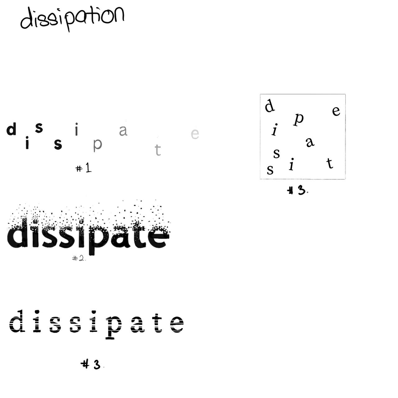
2.2 DISSIPATE

fig 1.7 Use #1 to pursue the type expression, Week 2 (11/4/2023)

fig 1.8 Use #1 to pursue the type expression, Week 2 (11/4/2023)
- I continue to improve #1 from the sketch since it is the most closest to the expression of the word using ITC New Baskerville std.
-
However, the placing of alphabets looked a little off so I
changed into the middle and used a lowercase 'd' instead as if
it's dispersing from the center.
2.3
FREEDOM
.png)
fig 1.9 #1 and #2 type expression on 'Freedom' Week 3
(18/4/2023)
- The font used for the expression is ITC Garamond Std. For the #1 expression, I used the brackets as a substitute of 'O' as an expression of 'm' running away or breaking out of a cage. #2 idea consists of using the roman letter, III as a cage, however, the overall composition did not express the word as properly.

- In the #3 expression, the roman letter, III was substitute with capital E's facing each other using the reflect option.
.png)
fig 1.11 #4 type expression on 'Freedom' Week 3
(18/4/2023)
2.4
CRUSH
.png)
fig 1.12 type expression on 'Crush' Week 3
(18/4/2023)
- For the word Crush, I used the font Gill Sans std, I rearranged the alphabets to make it look like the letter 'C' is crushing the other letters.
First Attempt

After receiving feedback on week 3 of the digitization process, I
reworked my type expression and finalize the expression with a few
minor changes.
Second Attempt

1. Rain- I changed the background to black to express the
calmness and melancholic vibe when it rains.
2. Dissipate- I moved the letter 'd' to follow the flow of
other letters.
3. Freedom- I switched the fonts to ITC Garamond std (bold)
because it suited the word better.
4. Crush- I changed the properties of 'C' into a shadowed
Gill sans as a way to make the C pop out more rather than blending
in the background.
Final Task: Exercise 1- Type Expressions
-01.jpg)
fig 1.14 Type Expression- JPEG week 3 (19/4/2023)
fig 1.15 Type Expression- PDF week 3 (19/4/2023)
Animation:
We have to choose one from the final type expression words to
be animated into a short GIF expression. Before animating, we
have to watch Mr Vinod's video on Type Animation which showed
us how to create frames in Illustration and compile them into
a Frame Animation feature in Photoshop. It is important to
have a general idea on how we want to animate the
expression.
I decided to animate "dissipate", the idea of the letters
slowly disappearing like smoke. (fig 16)
.png)
fig 1.15 28 frames for dissipate type animation week
4(24/4/2023)
First Attempt

fig 1.16 Dissipate animated GIF week 4
(25/4/2023)
The first attempt had a lot of flaws, the animation was not
as smooth and the word 'd' was not stagnant at one place,
furthermore, the opacity of the letters did not give the
animation the meaning of the word just yet.
Final Animated Type Expression

fig 1.17 Final Animated Type Expression (GIF) week
4 (25/4/2023)
TASK 1: Exercise 2- Type Formatting
For exercise 2, we have to create a layout of text
formatting, working with typefaces, line length, type size
and more. But first we have to understand how to work with
kerning and tracking.
1. Kerning and Tracking Exercise
We were assigned to apply kerning and tracking by typing our
name using the 10 fonts provided as part of the exercise.
Fig 2.1 Text formatting- Without and With
Kerning, week 4 (25/4/2023)
Fig 2.2 Both with and without kerning overlapped
to show differences, week 4 (25/4/2023)
2. Layout Exercise
For the layout exercise, we needed to create a final
layout using the text given and edit the text
formatting. We also have to find a picture suitable
to the text given and insert it in the layout. The
exercise is a way to create a better understanding
on text formatting and more attentive to small
details in creating good layout.


Fig 2.3 Layout #1 (left) Layout #2 (right) week
4 (25/4/2023)
Layout #1
HEAD
Font/s: Gill Sans MT bold (headline), Gill Sans MT
regular (byline).
Type Size/s: 60pt and 16pt (headline), 12pt
(byline).
Leading: 72pt and 19.2pt (headline), 14.4pt
(byline).
Paragraph Spacing: -
BODY
Font/s: Bembo Std Regular and Italic (body text)
Type Size/s: 15pt and 11pt (body text)
Leading: 18pt-italic, 13.2-regular (body text)
Paragraph Spacing: 11.5 mm (body text)
Alignment: Ragged Left
Margins: 12.9mm (top and bottom)
Columns: 4
Gutter: 4.23mm
Layout #2
HEAD
Font/s: Bodoni Std book (headline), Bodoni Std
Italic (byline)
Type Size/s: 66pt and 40pt (headline), 26pt
(byline)
Leading: 48pt and 79.2 pt (headline), 31.2pt
(byline)
Paragraph Spacing: -
BODY
Font/s: ITC New Baskerville Roman(body text),
Italic(Sub-heading)
Type Size/s: 9pt (body text), 19pt (sub-heading).
Leading: 12.8pt (body text), 20.8pt (sub-heading)
Paragraph Spacing: 11.5mm
Alignment: Justify with left line aligned left
Margins: 12.7 mm (top and bottom)
Columns: 5
Gutter: 4.23mm
After the feedback session in week 5, I decided to
make a new layout from layout #2 with some
inspiration from others' work while applying the
feedback that was given by Mr. Vinod.


fig 2.4 New layouts #3 (left), layout #4
(right) from layout #2 week 5
(1/52023)
Layout #4 & #5
Font/s: Futura Std (headline), Futura-italic
(byline).
Type Size/s: 32pt, 9pt (byline).
Leading: 38.4pt (headline), 10pt (byline).
Paragraph Spacing: -
BODY
Font/s: Janson Text Lt Std (body text); Futura Std
(caption)
Type Size/s: 10pt (body text), 10pt (caption)
Leading: 12pt (body text), 12pt (caption)
Paragraph Spacing: 11.5 mm (body text)
Alignment: Justify with left line aligned left
Margins: 12.9mm (top and bottom)
Columns: 2
Gutter: 5 mm
Final Task 1- Exercise 2: Text
Formatting

fig 2.5 Final Text Formatting (without
grids)-JPEG, Week 5 (1/5/2023)

fig 2.6 Final Text Formatting (with
grids)-JPEG, Week 5 (1/5/2023)
fig 2.7 Final Text Formatting (without
grids)- PDF week 5 (1/5/2023)
2.8 Final Text Formatting Layout (with
grids)- PDF week 5 (1/5/2023)
Feedback:
WEEK 2
General Feedback:
- Don't use fonts in sketches and the sketch should stay within logical distortion
- Keep the graphical elements to a minimum
- Should take a look on the fonts given by Mr. Vinod to sketch a new one later on.
Specific Feedback:
- For the sketches, there was a lot of graphic usage, some of the sketches used font, the words like 'Crush' doesn't really match the meaning of the word.
WEEK 3
General feedback:
- Graphical elements can be used if it's made with fonts if it is not distorted.
- Can further experiment with the fonts for some of the words
Specific Feedback:
- For 'C' in the word crush can be a bit bolder and the words underneath it can be changed to lowercase.
- For the word dissipate, the letters could be spread out form the middle in a zig zag formation
- For the word freedom, the idea of 'EE' as a cage is rather confusing so another alternative or changing it to normal could be an option.
WEEK 4:
General Feedback:
-Pause the frame at the end of the GIF for 2 seconds
-Don't change the perspective from big to small Specific
Specific Feedback:
- The movements are too stiff and needs smoother animation
WEEK 5:
General feedback:
-Make sure to take note of the characteristic of the font used
- The space between paragraphs in body text should suit the readability of the font.
- Need to have at least 5mm space when aligning paragraph side by side.
- 7mm spacing for paragraphs with justified text.
Specific feedback:
- Image chosen should be relevant with the text given.
- For capital abbreviations, solve it by either downsizing, reducing font size or use small capitals instead.
-The text fonts are too big
-The overall composition is too compact.
WEEK 6
General Feedback:
- Do not compensate colour/black space when there's something wrong with the template.
- Distortion of words are not allowed.
- 2-3 different line lengths are not advisable
- Must explore different variation of expression for the headline.
Specific feedback:
- The correlation between 'Headline' and the 'Body Paragraph' must means what it means.
- Must always consider face value (how the viewers/readers would see the text).
Reflection:
Experience
The five weeks in completing the Task 1 exercise had been quite
hectic. The exercise was broken down bit by bit and we received
feedback every week that we were supposed to prepare and show our
progress during the class to Mr Vinod. Although, Mr Vinod always
emphasizes the importance of making your own judgements as well
and learning what you can from your classmates throughout the
class, analyze the feedbacks given to their work and take whatever
feedbacks that could be used to improve my own work. In addition,
exercising active learning is also crucial and not just completing
work just to meet deadlines. We were also given pre-recorded
lectures on YouTube for added materials in learning about
Typography as we do our practical assignment. In Text Expression,
creating expressions for the four words was challenging as it
needed to be unique to myself since the rest of the class were
given the same word. I have never used Adobe Illustration before
and it took a lot of time learning, I was slowly getting used to
it.
Observation
I observed that I had a lot of troubles keeping up with the
pace in some of the weeks and I was not able to show my progress
which I realized that could affect the quality of my work, since
external feedbacks are necessary for improving. To tackle this
issue, I had to change my mindset and find an alternative way to
criticize my own work by incorporating feedbacks given to my
classmates that had similar sense to mine and also getting honest
opinions from my peers.
Findings
In Typography, learning how to arrange letters, paragraphs or
layout requires a lot of attention to detail from the text
alignment to letter spacing. Typography had become an expression
in our daily life, we come across it every single day from
posters, magazines, shop boards, etc. Going through the process of
creating a good typography from scratch have made me appreciate
good typography that I come across every now and then, while
analyzing it's component trying to figure out what made it so
eye-catching.
I should learn how to manage my time properly, so that I could
catch up with all the modules and produce quality work that I am
proud of. The habit of perfecting and overthinking about the small
details of my work have caused a lot of stagnancy in my own
progress, I should break out the habit of doubting and pursue the
assignments with a bigger picture and understanding that every
failure is not the end.
I also need to be more attentive in Mr Vinod's class so that I
won't miss out on important details and jot them down on my phone
as a record. I need to improve my discipline and consistency to
break the mindset of completing works to meet the deadlines,
learning what I can as I go through this module and being
confident with the work I have produced while also keeping an open
mind to others feedback should be the mindset I have to implement.
3. Further reading:

The Vignelli Canon by Massimo Vignelli
Italian designer Massimo Vignelli is well-known for his work in
both visual and industrial design. He produced this book for
graphic designers to enhance their understanding of typographic
concepts as well as the rules, standards, and guidelines of
graphic design.
The Intangibles and The Tangibles are the two sections that make
up this book. One of the three components of design (Semantics,
Syntactics, and Pragmatics) that are significant to Vignelli is
the "Semantics" in Part One: The Intangibles.
Semantics
In Vignelli's perspective, Semantics is the search of meaning
behind whatever we have to design. Understanding what it is that
designers try to portray through research on the history of
subject to find the appropriate approach that expresses the design
well. In order to seek satisfaction, a designer should investigate
the complexities, ambiguity and context of use better define the
parameters.
Semantics holds significant value in design as it act as a medium
to relate the subject to the sender and receiver in a way that
makes sense. Upholding the correct design process and creating
honest forms of vernacular communication should be uphold by young
designers in futures to come.
Comments
Post a Comment