DIGITAL PHOTOGRAPHY & IMAGING: Project 1/Exercises


DIGITAL PHOTOGRAPHY & IMAGING 

6 April 2023


04.04.2023- 05.05.2023/Week 1 - Week 5
Nur Fariha Binti Mohd Rodzuan/0351242
Digital Photography and Imaging/Bachelors (Hons) in
Creative Media

Lists

1. Lectures
2. Practical
3. Project 1:
  • Task 1A Physical Collage
  • Task 1B Digital Collage


INTRODUCTION:

In the first week, Mr Fauzi gave us a rundown of what we would be learning from the module information booklet as we progress into the module throughout the semester. Mr Fauzi briefed us on the important key factors if Photoshop and tips on how to become a successful designer. 


Module Information Booklet


LECTURES:

WEEK 1 (Lecture): Introduction to Digital Photography and Imaging


Lecture Summary: 

For the first week, we were introduced to the Adobe photoshop software:

1. The importance of photoshop for graphic designer:
  • It is a medium to express creativity
  • To create Graphic Design
  • Restoration of old images
  • Integrate graphics with text artistically
  • Make use of brushes to enhance graphic artwork
  • Change photo color
  • Rectify mistakes in photographs
2. Digital Imaging: 
  • An act of converting printed text, artwork and photographs into digital images using a digital scanner or another imaging device.
3. 10 Tips of Successful Graphic Designer:
  • #1 Follow the tutorials
  • #2 Experiment on using tools in photoshop in order to get comfortable with the software.
  • #3 Memorize all keyboard shortcuts
  • #4 Try to replicate others work
  • #5 Do Participate in Design Competitions
  • #6 Subscribe to online galleries
  • #7 Smart object for smart designers
  • #8 Scaling Artwork and proportions
  • #9 Use actions to Personalize Artwork
  • #10 Organize the files properly


WEEK 2 (Lecture) - Introduction to Basic Composition


Lecture Summary: 

1.Basic compositions for design:
  • Focal Point
  • Scale and Hierarchy
  • Balance the elements (remember that each elements have a 'weight' to it)
  • White space/empty space
  • Rule of Thirds
  • Golden Ratio
2. Composition (Framing & Cropping)


Shot framing guide


3. Types of Shot Framing: 

Single shot
  • Individual characters in one frame with primary focus.
  • clean single: limited presence of another person in frame.
  • Close-up, medium or wide view shots are still considered under the same single shot category.
Two shots
  • both phases must be clearly visible
  • the shot creates a visible relationship between characters.
Three-Five shot
  • Shots of more than two people 
Crowd Shot
  • More than 5 people in a frame (crowds in war).
Over the shoulder shot
  • Similar with the single shot but the perspective of other character is present.
Point of View
  • Can cover wide range of perspective 
  • Always paired with a P.O.V shot audio.
Insert shot
  • extremely tight detail
  • the information detailed in the frame is important
  • In first person perspective, third point perspective or hybrid perspective.


WEEK 3- Introduction to Photoshop 2


Lecture Summary:

Lasso ToolLasso tool allows you to draw and pinpoint specific areas of a document.

Pen tool: A common tool to use when creating a path from scratch.

Layering: Layers are different images stacked on top of each other, these layers help you to make adjustments without affecting other layers.


WEEK 4 - Introduction to Photoshop 3: Adjustment and Layers


Lecture Summary:

1. Adjustment Layer:
  • Non-destructive image editing tools that add color and tonal adjustments to your image.
  • You can edit and discard your adjustments or restore your original image at any time.
  • Brightness/Contrast: brightness slider is for adjusting highlights in your image and contrast slider is for adjusting shadows in your image.
  • Level: Modify tonal values in an image by adjusting the levels of shadows, midtones and highlights.
  • Curves: A very precise tool to adjust tonal range of your image.
  • Exposure: There are three sliders under this category which are Exposure, Offset and Gamma.
  • Selective Color: selectively modifies the amount of primary color without modifying the other primary color.
2. Filters:
  • There are filters to change color, add blur or create a differently new image effects

Photo filter trick in Photoshop


WEEK 5 - Digital Photography


Lecture Summary:

Exposure Setting:
-IRIS: Iris/Aperture is control the flow of light entering the lens.
           Measure by f-stop and the lower the f-number the larger the opening.

-SHUTTER: A small plastic sheet of paper that opens and closes to allow light onto the film or prevent light from reaching film.

-SHUTTER SPEED: Measured by seconds (1/1000s, 1/500s, etc)

-ISO: Sensitivity of film- it's 'light gathering' ability or sensitivity, the signal gain of the camera's sensor.
          Common ISO setting: 100,200,400,640,800,1600,3200,6400...
          The lower the ISO the lest sensitive your camera is to light and the finer the grain.

Lens Perspective

FOCAL LENGTH: The shorter the focal length, the wider the angle of view and vice-versa.


WEEK 6- Poster Design


Lecture Summary:

The 7 Principles of Poster Design:
1. Emphasis
2. Balance and Alignment
3. Contrast
4. Repetition
5. Proportion 
6. Movement
7. White Space

WEEK 7- Double Exposure


Lecture Summary:

Double exposure refers to merging multiple images. The goal is to make them surreal, emotional and humorous (usually features silhouette)

Different ways to create double exposure: 
1. Using the Tilt-Shift Effect
2. Create fake reflection
3. Experiment with simple portraits and details textured
4. Convert your results to black and white
5. Wok with Silhouette 
6. Pick two random
7. Make simple object looks fascinating
8. Use shadow

WEEK 9- Digital Surrealism


Lecture Summary:

Realism: Takes subject matters of the ordinary and common world we call reality.
Surrealism: A twist on Realism, distorts ordinary (reality) and concentrating on dream-images.

What is Digital Surrealism?
Surrealism is a cultural movement focused on arts to express about the artist's idea themselves and it became the top digital art styles.

How can I start creating Surrealism artworks?
  • Dream-like scenes and symbolic images
  • Unexpected, Illogical juxtapositions
  • Bizarre assemblages of ordinary objects
  • Primitive or Child-like designs
  • Sketch it out and Find reference images.
Mindset During Creation

  • Does this look real? 
  • Make it happen to your best ability.
 
WEEK 10- After Effects Exercises


Lecture Summary:

Motion graphic animation that works by manipulating vector and rasterized art to create and tell story.

Compositing Layers in After Effects?

  • All the layers must be organized and synchronized to the external software platforms such as phot shop and illustrator.  


PRACTICAL

We were assigned to the following tasks:

1. Prepare materials (cut out magazines or printed pictures) for physical collage in Week 2

2. E-portfolio and Pinterest board sign up: https://pin.it/3AXGHgy

3. Choosing three favorite Graphic Design artwork.

3.1. Artwork from Pinterest (week 1, 6/4/2023)

Description: When I first saw the picture, the overall clean composition of various pictures compressed into one illustration caught my interest  

The poster expressed: In my perspective, the illustration expresses the lifestyle of people enjoying themselves in their own way. The blue-purple color scheme creates a calm yet invigorating atmosphere, a perfect way to express the mixture of emotions in balancing work and life balance for many people. I admire the way pictures are arranged and tells a story, like reading a comic panel.


3.2 Artwork from Pinterest


Description: When I first saw the picture, the minimalist deco art style emanates vintage Hollywood's style in the 90's

The poster expressed: The illustration expresses sophistication and elegance of a man and woman enjoying their evening through use of geometric shapes with little use of black line art. The poster falls under the theme of modern art deco, which are usually used to express luxury and glamor.


3.3 Artwork from Pinterest


Description: When I encountered this collage, I was instantly drawn to the arrangement of pictures.


The poster expressed:

An internal expression of the artist’s perspective on how they perceive themselves. The colors in a rainbow can symbolize characteristic traits, emotions or presentation of positivity. “It’s not all sunshine and rainbows but a good amount of it”, expressed on how life is unpredictable, good and bad days are bound to happen. The overall concept of the poster is about the inner workings of the mind specifically on how the artist perceive life as a whole and how they live in it. 


PROJECT 1: COLLAGE DESIGN ELEMENTS


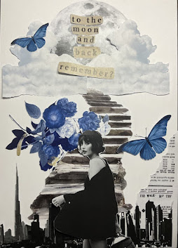
1A Physical Collage


We had to prepare materials/cut out pictures from magazines, newspaper any type of media to create the collage.

Using the images, we were required to create three physical compositions and choose the best one to pursue in.


PRE-COMPOSITION #1

fig 1 pre-composition #1

PRE-COMPOSITION #2


fig 2 pre-composition #2

PRE-COMPOSITION #3


fig 3 pre-composition #3


1B Digital Collage


For the digital collage, Mr Fauzi gave us the rundown of the tools in photoshop that we could experiment during tutorial class in week 3. We were given 16 JPEG pictures to create three pre-composition collages

using tools in Photoshop.


PRE-COMPOSITION #1


fig 4 Digital collage composition #1 (week 3 20/4/2023)


PRE-COMPOSITION #2

fig 5 Digital collage composition #2 (week 3 20/4/2023)


PRE-COMPOSITION #3


fig 6 Digital collage composition #3 (week 3 20/4/2023)


From the three compositions created, we need to choose one of the composition to further improve the artwork using adjustment layers and filters that were introduced to us on week 4.


BEFORE AND AFTER


                                       Before                                                                                        After
  
   
DESCRIPTION:

During the process of collage layering, I have learned how to use ‘Grouping’  tool combining more than one element in the collage for consistency of the artwork. After that, I learned how to use the lasso tool to select particular elements and using the color fill tools to change the colors, I wanted to focus on the vibrant blue that are present in the artwork so I used the adjustment tool to experiment and increase contrast and brightness. Finally, I applied a photo filter feature into the artwork to portray the atmosphere I had in mind.


Comments

Popular Posts